Game Design Updates #03 HUD Design
The user interface is one of the most important aspects of a finished game, it relays critical information to the player in real-time. It needs to be clear, readable, and efficient. But getting to that point can be a challenge… it can take many iterations to arrive at something acceptable, let alone excellent.
We’ve got Grant, our Lead Designer, on hand to chat about some of the processes and challenges the development of a UI can go through:
Attempt 1
I think this is actually attempt 10 or something, but it was the first one in game that was tested with the public, so I’ll call it attempt 1 as we got some proper, on the ground feedback about it.
Was this created as a prototype, or did you hope it would be the final version?
It was always a prototype. Every UI we make is a prototype until it works exactly how we want. The information we need to relay to the player needs to be in the right place, understandable, clean and easy to spot at a glance. This didn’t have those things, but its hard to see that until its working in game.
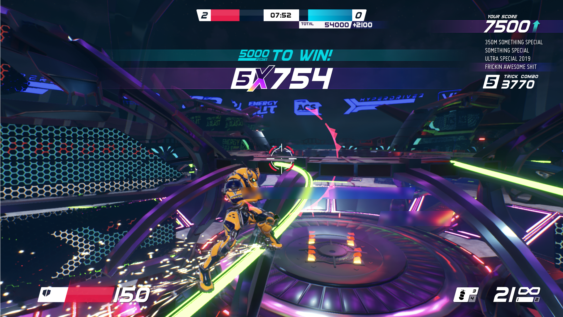
What were the main issues with this version?
There’s a total disconnect between the heat elements of the screen. They are too spread out. We have our current combo and score just above the cross hair, the moves, trick combo and total score on the upper right and the total team score in the top at the centre. The information is too spread out, you have to look at three points of the screen to get information on one element of the game.
Also, the weapon information is stuck down in the other corner and a bit small, as well as being hard to read and to see what you actually had equipped. In fact it was impossible because there is no indication of what the weapon is, only the number in your inventory.
Attempt 2
After the missteps on attempt 1, we tried to fix the problems. Which led to more problems. User interface design is not fun sometimes!
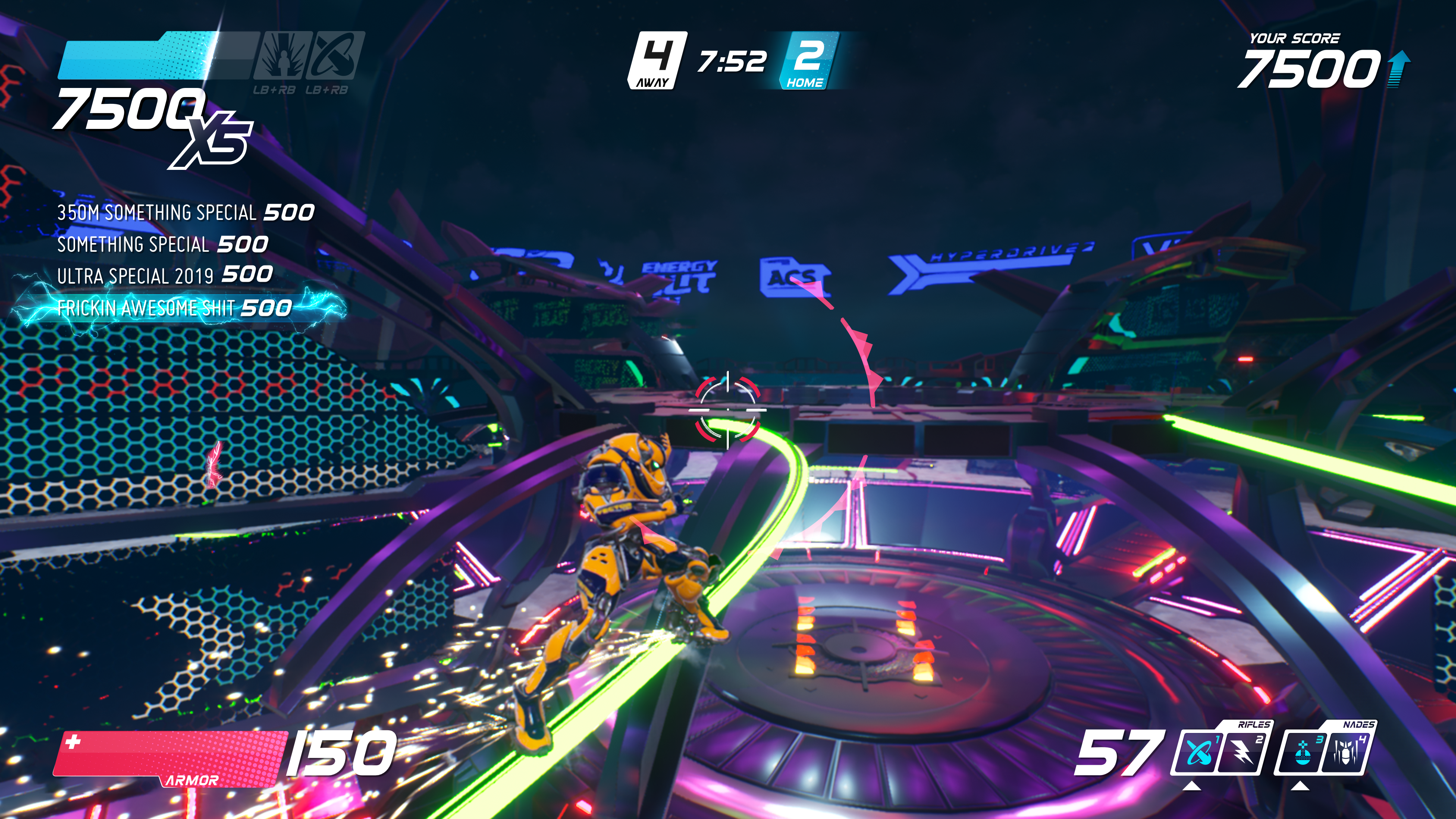
Why is this better than the last one?
The grouping is much better, all the elements you need are now together (well all apart from your total score which is top right). The main change was that all the heat information is now grouped top left. We also changed the way that weapons are displayed and gave them icons so you can see which one is equipped.
How long did it take to realise that another remake was needed?
It was a gradual thing, I was slowly moving the pieces around in the wire frame as we were playing. My changes weren’t reflected in the game of course, but I could make changes to a new version. Once we decided on the private beta I wanted to get the new version in game.
What were the main issues with this version?
First, we added abilities that you can use at a certain amount of heat. You can see them top left at the end of the heat bar greyed out. This isn’t ideal because 1) you can’t see when the heat ability is activated, and 2) you can’t make them out very well (with them being grayed out). These were a late addition so added at the last minute.
The move list was also too big. It also scrolled too fast despite of its size and in some cases and you couldn’t get a good view of all your moves in that chain.
Attempt 3
This is slightly out of date now, maybe 4/5 revisions behind (so not so slightly out of date really). We have a new version with some changes to it, but that will be added to the next beta test we will be having. First the grenades are now gone, replaced with something else that won’t make the beta test. 😉

Why is this better than the last one?
First, go back to the last two HUD’s and look at the amount of data on there and then come back here, forget about the grenades. It’s much cleaner and easier to both see and read. Everything is grouped nicely and you can glance at three parts of the screen, centre top, bottom left and bottom right to get the information you need.
We also moved the health to above the robots head. This also works for enemies, you can see their health above their heads too.
We also added more space for the move list and combos, they are bottom centre just below the robot. Because you’re watching the robot at all times, both the move list, combo and health are easier, and most important, faster, to see.
The big changes are the trackers, you can see when an enemy is about to score a point so you can hunt them down. There’s also a friendly version so you can go and protect them from the hunters if you wish.
Do you think it will be the final HUD for Overstep?
No. Like I said above we have already improved it more. We won’t stop until the final game is out or we are happy, whichever comes first.
What would you say makes a great HUD?
I’ll copy, paste and edit what I said above because I’m both busy and lazy. A good HUD will relay information the player needs quickly and easily. To achieve that the information needs to be in the right place, be understandable, clean and easy to spot at a glance.
We’re getting there……